
Creative Director & CEO:
Alexandra Fierra
Visual Identity & Brand Package:
Cotton Design
Photography:
Eva Tusquets, Cassandra Marie
Illustrations:
Madonna Murphy

Top: Front & back cover
Bottom: Inside of print brochure
Photographs by Eva Tusquets
When I joined Eternal Research in 2024, our first product, the Demon Box, was still in development. Before the product was commercially available, with only prototypes to demonstrate at trade shows and conventions, our branding was a gateway to make a distinct impression and build company recognition. I created this brochure in adherence with our brand guidelines, writing the copy and formatting the layout.

Top: Convention display case at NAMM 2026
Bottom left: NAMM 2026 booth display area (decorative frame by Madonna Murphy)
Bottom right: Event programs and postcards from Rite Of The Demon: Spring (poster by Madonna Murphy)
Our branding had to be scaled to many different sizes depending on our needs from print media to large-scale event installations. I was responsible for creating and formatting many brand assets for their appropriate environment, as well as communicating with vendors for the execution of these assets. The applications ranged from physical media, event & educational signage, and large-format installations for convention displays.

Top: our video demo gallery. Photograph by Eva Tusquets
Bottom left: Upcoming Events page. Frame illustration by Madonna Murphy
Bottom right: our Articles press page
I created & maintained the EPK for Eternal Research which gets distributed widely for booking events, artist partnerships, and more. I wrote all of our copy for the EPK - the story of our origins and the breadth of our evolution from DIY experimentation into a robust synesthetic electronic instrument. The kit showcases our accomplishments but also beautifully represents our branding tone and scope. Function did not come second to form: the kit had to support a rapidly growing number of press links, catalogue our video demos, and list the upcoming events on our roster. Maintaining the press kit was a wonderfully rewarding project that allowed me to stay with one project for a long period of time and experiment with many different creative solutions.

Top left: Original sketch by Madonna Murphy
Top middle: Initial tracing result
Top right, enlarged: Final vectorized design, incorporating our logo and wordmark
Bottom image: Model wearing finalized product, photograph by Eva Tusquets
I often digitally formatted assets for our apparel and accessories manufacturing. In a creatively and technically challenging assignment, I turned a sketch from brand illustrator Madonna Murphy (top, left) into a proportioned, vectorized design for an enamel pin. Preparing assets for production was an excellent training ground to enhance my technical skills in design, and an exercise in applying new techniques under short deadlines.
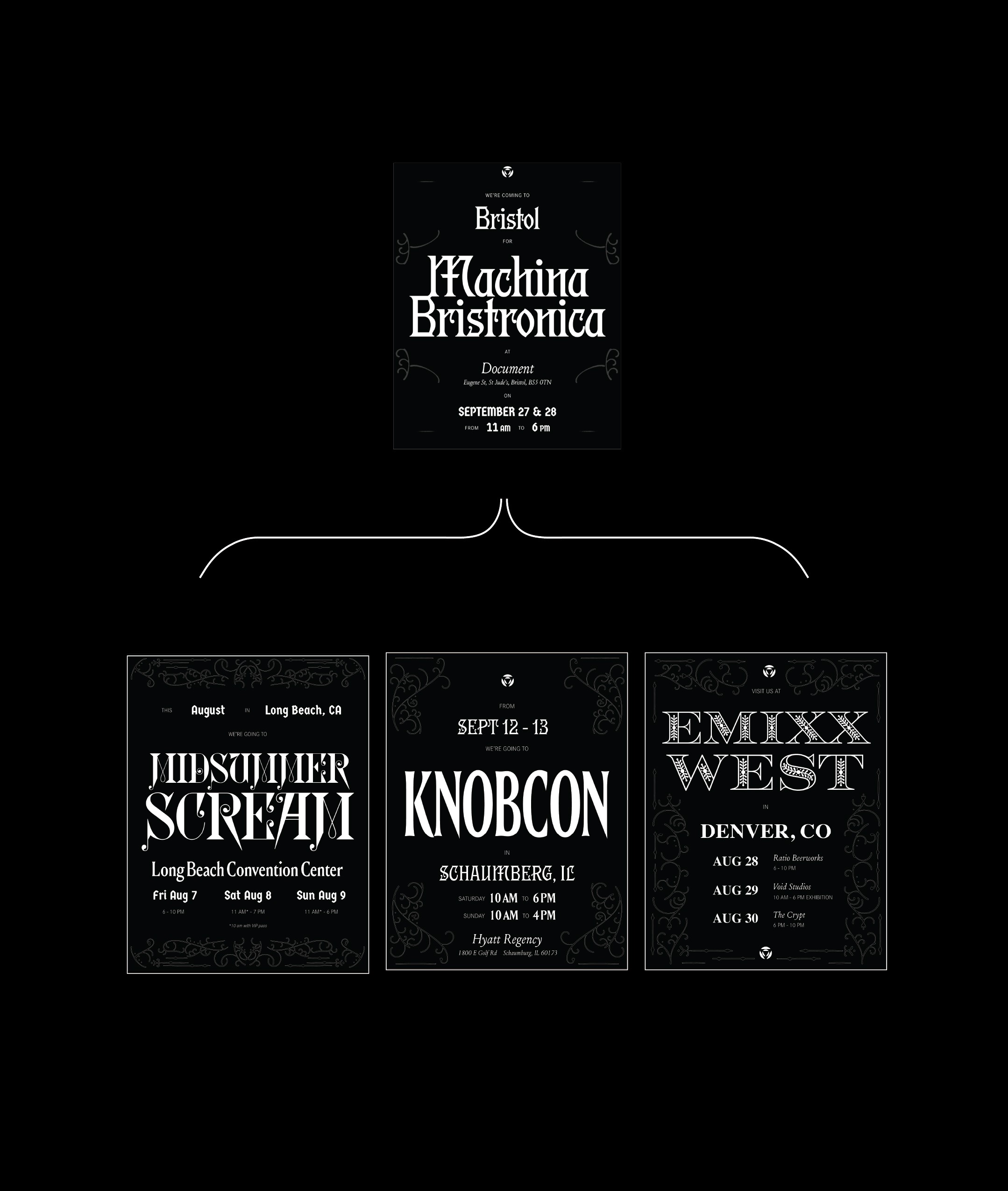
Top Row: A poster by Cotton Design using the brand guidelines they created for Eternal Research
Bottom Row: Iterative work I’ve created using & expanding on the brand guidelines
Using a template generated for us by Cotton Design, I put together several assets for our events for posting across our social accounts. Replicating a professionally created template was great training for adhering to brand style guides for many different events. Creating these posters was always a fun exercise in contrast, balance, and scale, centering typography as the primary design element.

A four-panel excerpt from the 2026 sales deck PDF shared with retailers and distributors as part of our sales outreach.
In 2025 Eternal Research began fostering relationships with domestic and international distributors to carry our first product, the Demon Box. I was responsible for creating sales media for us to make our case to stores and distribution partners in regions all across the globe. These had to be visually appealing yet communicative guides to show potential retail partners what kinds of questions Eternal Research is answering in the electronic music community.
I wrote the copy for our B2B sales deck and product description, honing on on what our remarkably unique instrument provides for consumers in the electronic music space and how the community has already shown significant interest. I designed the layout, opting for a simplified version of our brand style in order to display our aesthetic yet remain approachable for people new to our brand.

Top left: A black frame with a thin white border, designed to function on a black background
Top right: the same frame shown on a white background
Bottom right: Screenshot showing dark mode inversion, with temporary solution
Bottom left: The new frames implemented in our welcome email automation chain for new subscribers, show on a device in dark mode
Consistent execution of our brand style over email proved difficult because of ‘dark mode’ in Chrome and Apple devices. Dark mode inverts the code for most HTML, and would invert our entire color scheme, leading to less visual consistency. After some stop-gap measures, I asked our brand illustrator Madonna Murphy to create a series of .png frames for us as a background for text These frames would appear in both our standard and inverted email appearances, creating an elegant solution within the confines of the technology. We primarily use these for title headings to keep our alt-text needs minial. The tension between Victorian-era design in a 21st century medium is something that felt appropriate for Eternal Research’s personality and contributes to our brand worldbuilding.
Top: Front & back cover
Bottom: Inside of print brochure
Photographs by Eva Tusquets
When I joined Eternal Research in 2024, our first product, the Demon Box, was still in development. Before the product was commercially available, with only prototypes to demonstrate at trade shows and conventions, our branding was a gateway to make a distinct impression and build company recognition. I created this brochure in adherence with our brand guidelines, writing the copy and formatting the layout.
Top: Convention display case at NAMM 2026
Bottom left: NAMM 2026 booth display area (decorative frame by Madonna Murphy)
Bottom right: Event programs and postcards from Rite Of The Demon: Spring (poster by Madonna Murphy)
Our branding had to be scaled to many different sizes depending on our needs from print media to large-scale event installations. I was responsible for creating and formatting many brand assets for their appropriate environment, as well as communicating with vendors for the execution of these assets. The applications ranged from physical media, event & educational signage, and large-format installations for convention displays.
Top: our video demo gallery. Photograph by Eva Tusquets
Bottom left: Upcoming Events page. Frame illustration by Madonna Murphy
Bottom right: our Articles press page
I created & maintained the EPK for Eternal Research which gets distributed widely for booking events, artist partnerships, and more. I wrote all of our copy for the EPK - the story of our origins and the breadth of our evolution from DIY experimentation into a robust synesthetic electronic instrument. The kit showcases our accomplishments but also beautifully represents our branding tone and scope. Function did not come second to form: the kit had to support a rapidly growing number of press links, catalogue our video demos, and list the upcoming events on our roster. Maintaining the press kit was a wonderfully rewarding project that allowed me to stay with one project for a long period of time and experiment with many different creative solutions.
Top left: Original sketch by Madonna Murphy
Top middle: Initial tracing result
Top right, enlarged: Final vectorized design, incorporating our logo and wordmark
Bottom image: Model wearing finalized product, photograph by Eva Tusquets
I often digitally formatted assets for our apparel and accessories manufacturing. In a creatively and technically challenging assignment, I turned a sketch from brand illustrator Madonna Murphy (top, left) into a proportioned, vectorized design for an enamel pin. Preparing assets for production was an excellent training ground to enhance my technical skills in design, and an exercise in applying new techniques under short deadlines.
Top Row: A poster by Cotton Design using the brand guidelines they created for Eternal Research
Bottom Row: Iterative work I’ve created using & expanding on the brand guidelines
Using a template generated for us by Cotton Design, I put together several assets for our events for posting across our social accounts. Replicating a professionally created template was great training for adhering to brand style guides for many different events. Creating these posters was always a fun exercise in contrast, balance, and scale, centering typography as the primary design element.
A four-panel excerpt from the 2026 sales deck PDF shared with retailers and distributors as part of our sales outreach.
In 2025 Eternal Research began fostering relationships with domestic and international distributors to carry our first product, the Demon Box. I was responsible for creating sales media for us to make our case to stores and distribution partners in regions all across the globe. These had to be visually appealing yet communicative guides to show potential retail partners what kinds of questions Eternal Research is answering in the electronic music community.
I wrote the copy for our B2B sales deck and product description, honing on on what our remarkably unique instrument provides for consumers in the electronic music space and how the community has already shown significant interest. I designed the layout, opting for a simplified version of our brand style in order to display our aesthetic yet remain approachable for people new to our brand.
Top left: A black frame with a thin white border, designed to function on a black background
Top right: the same frame shown on a white background
Bottom right: Screenshot showing dark mode inversion, with temporary solution
Bottom left: The new frames implemented in our welcome email automation chain for new subscribers, show on a device in dark mode
Consistent execution of our brand style over email proved difficult because of ‘dark mode’ in Chrome and Apple devices. Dark mode inverts the code for most HTML, and would invert our entire color scheme, leading to less visual consistency. After some stop-gap measures, I asked our brand illustrator Madonna Murphy to create a series of .png frames for us as a background for text These frames would appear in both our standard and inverted email appearances, creating an elegant solution within the confines of the technology. We primarily use these for title headings to keep our alt-text needs minial. The tension between Victorian-era design in a 21st century medium is something that felt appropriate for Eternal Research’s personality and contributes to our brand worldbuilding.